Hacker Remix
Ask HN: Minecraft's UI element style (vs. modern flat glass interface)
18 points by xeonmc 2 days ago | 16 comments
For a specific case study I’d like to ask what HN thinks of the UI design language of Minecraft, specifically the semi-3D button and slider looks motivated by a need to convey visual hierarchy given a constrained pixel-art granularity budget.
It utilizes different shades of grey borders to convey a sort of faux surface-normal highlight on beveled edges to indicate whether the element is raised or sunken.
I think this is an interesting innovation of min-maxing the visual complexity budget, perhaps the modern beveled-glass design language could draw some inspirations from here?
uncircle 2 days ago
You mean this? https://feedback.minecraft.net/hc/user_images/01HQQV8HYE6GKB...
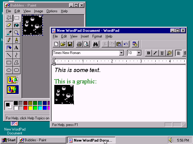
That's the Windows 9x style ported to a low resolution UI, probably with some shaders because computers today are fancier than 1995. It's not interesting innovation, though I agree it's much better (and feels better) than the flat UI boring aesthetic.
Behold the peak of desktop UIs: https://blogs.ubc.ca/nancyhuang/files/2015/10/Windows95.png
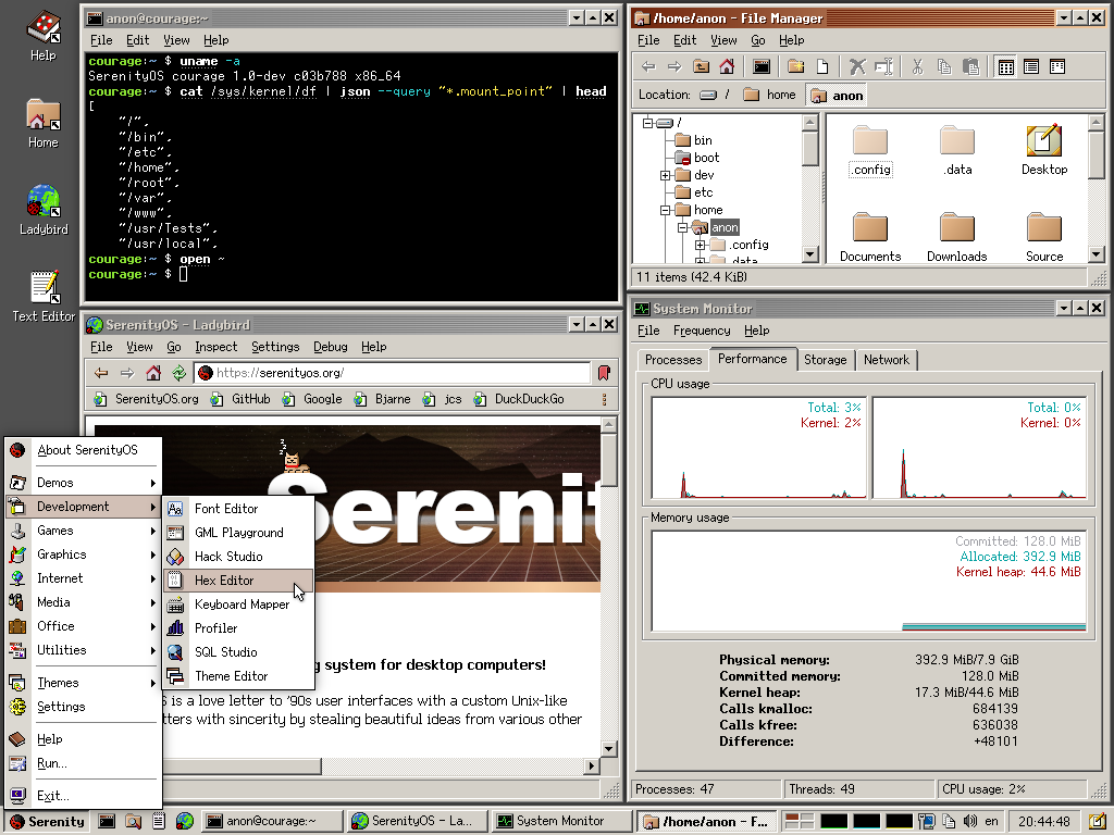
See also SerenityOS with an Office 2000 look which added some flatter UI concepts, yet it still is tastefully tactile and three-dimensional: https://raw.githubusercontent.com/SerenityOS/serenity/refs/h...
LauraMedia 2 days ago
https://minecraft.wiki/images/thumb/Ore_UI_Design_System.png...
https://minecraft.wiki/images/New_UI_-_Achievements_Screen_M...
hofrogs 2 days ago
WorldMaker 2 days ago
potato-peeler 2 days ago
UI of 98 era had minimal controls. Even open source alternatives like photopea which are less bloated than photoshop, give more controls and as such those softwares can’t adopt a 98 style skin, unless it wants to be messy with controls all over the place.
pjc50 2 days ago
card_zero 2 days ago
Do you think the Photoshop of the era was messy with too many controls visible at once, and that a more modern UI solves that? How, what do you mean?
dcminter 2 days ago
matt_s 2 days ago
Setting that aside, video game visuals serve a different purpose than application UI widgets for menus, forms, buttons, etc. In a video game there are different reasons to highlight objects in a game world and relative to other objects and their movement or ability to move/interact with them. Objects in a game world might have their own light source, move in different ways so that the player knows its something they can interact with. If you look at open world games there are a lot of things happening visually in varying degrees of grabbing the gamers attention.
In a UI that is task oriented, like operating systems for PCs or phones, there needs to be less visual clutter, its not a game. It should be obvious to massive numbers of the population what function a UI element serves and accessibility standards come into play because often these OSes are used in corporate environments which should allow for people with different visual abilities to do their work.
qwool 2 days ago
pjc50 2 days ago
codingdave 2 days ago
That is the key point. If your app has such a constraint, then copying their techniques might make sense. But if it doesn't, you would be pulling in a solution to a problem you do not have.
whywhywhywhy 2 days ago
0xCE0 2 days ago
sandra_vu 2 days ago
If you want to dive into how to design for glance. Recommend Stephen Few's books.
gizajob 2 days ago